Being Ikea & beating the kitchen memo effect
How data underpinned the success of new fully mobile focused news sites
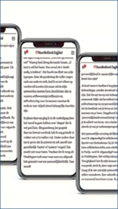
This page is optimized for mobile phones
Preface
Everyone knows them. Memos taped on the office dishwasher. Or on the fridge. Once hung up by a colleague with a message. Yellowed, curled up in a corner. And nobody reads what it says.
We also found this kind of kitchen notes in the data on our news sites. Fixed spots and sticky positions in the news stream that almost no one was looking at. These and other insights formed the basis and success of the evolution of our (mobile) sites.
.

For which the Swedish furniture giant Ikea has been a great inspiration. Excelling at attracting an audience, but more importantly, keeping them inside. A reader should walk away with more items in their basket than just the one they came for.
So, please step into our story of data driven redesign.
Getting started: how one newsroom transformed to digital
Haarlems Dagblad, one of our five regional news brands (Noordhollands Dagblad, Leidsch Dagblad, IJmuider Courant, De Gooi- en Eemlander) in the west of the Netherlands (part of international publisher Mediahuis), dates back to 1656. More than three centuries of independent journalism based on experience and intuition. A very rich past, something to be proud of, but we can’t build a future on the success and glory of the past alone. Times have changed, and a radical change of direction was needed to reverse the year-on-year decline in subscriptions.
In recent years, we fully adapted to the changing media landscape and began to fight for a future as rich as our past. We completely changed our workflow, moving our content creators (over 140 journalists) from old habits to a digital-first process.
‘We began to fight for a future as rich as our past’
We continued to write good stories, produced more audio and video, but the channel on which we primarily published changed: from print-first to digital-first. A small, centralized print team now puts together five newspapers, 12 editions, and a total of 150 unique pages from late afternoon.
All this led to significant growth in subscriptions. We went from 155,000 paid subscribers to 165,000, of which 55,000 are now fully digital. With our ‘win or learn’ mentality, we learned a lot and felt we were winning by getting many things right, but there is no room for complacency. Because the truth is that we missed one important change around us:
The world went mobile, we did not.
The penny dropped when the desktop site went down
Sometimes you know something, but you are not fully aware of it. The fact that the whole world, including journalists, goes through life constantly with a mobile phone in hand is one such realization. Our editors may have worked entirely digitally first, but their main focus was on how stories would appear on desktop screens.
 But stories that look great on desktop are not necessarily optimized for mobile. For example, graphics designed for desktop or print are often unreadable on mobile. Likewise, selected photos may lose impact when reduced to a tiny mobile screen format. And text that appears well-balanced with enrichments on desktop can easily turn into overwhelming walls of text on mobile.
The online desk, responsible for all digital publishing channels, also focused primarily on desktop. While consumers primarily viewed content on vertical mobile screens, these colleagues worked on large horizontal desktop screens. Dozens of headline tests were conducted daily to optimize the site. Headline variations were tested exclusively on the desktop audience before being adjusted. However, these ‘winning’ headlines were then applied to the app and mobile site, which had a different layout, sometimes resulting in truncated or poorly displayed headlines.
‘Stories that look great on desktop are not necessarily great on mobile’
But how significant was the desktop site in our total traffic? We were too busy producing and distributing high-quality journalism to truly consider that question.
The penny dropped when a technical issue took our desktop sites down for an afternoon. The mobile site and app remained online, and while there was some panic in the newsroom, the traffic on our dashboard remained stable. In fact, we exceeded the four-week average. An unplanned A/B test, but one with major consequences.
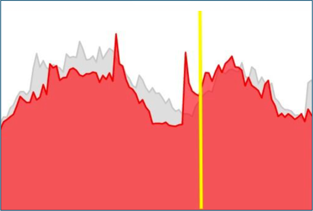
The yellow line is where the desktop site went down.
The focus had to shift dramatically. It marked the beginning of the ‘Mobile First’ project. The workflow in the newsroom — and the product itself — needed a radical overhaul.
In search of leads: a dive into the data
We began the project by close examining the usage of our mobile site and app. While editorial teams have long started their days with data reports on their content and conducted in-depth analyses of topics and approaches, we had limited insight into how design choices impacted the performance of our journalism.
Many of these design choices were originally driven by desktop design, which became the foundation of the mobile user experience. Analyzing reader insights and app usage uncovered key revelations.
We had overlooked these insights in previous years, and where we had suspicions, we chose to ignore them.
The 6 most striking results:
1. Mobile, mobile, mobile…
No less than 87% of our online traffic came from mobile (m-site and app), and this percentage continues to grow every month.
2. The home page is not the main entrance
In 67% of stories read, traffic bypassed the homepage, with visitors landing directly on the story. Google, other articles and, to a lesser degree, Facebook were the primary traffic sources. The story detail page was intended as the primary entry point to our brand, yet online editors focused most of their efforts on designing and managing the homepage and section pages.

Consequently, the rich content and unique story mix that define our brand remained largely unseen by most of our audience.
3. The main entrance also turned out to be the main exit
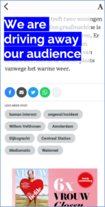
The data revealed that the article detail page was not only the primary entry point for most of our audience but also the main exit point. Of those who landed on an article, only 1 in 10 continued to another article. The others read, watched or listened and then apparently clicked away.
‘Of 10 people who landed on an article, 9 clicked away after reading’
The click-through rate per article was just 1.1. So, through the main entrance —the article — most visitors left just as quickly. A challenging recirculation issue that we, blinded by rising traffic, growing digital subscriptions, and an increasing attention span, had barely noticed.
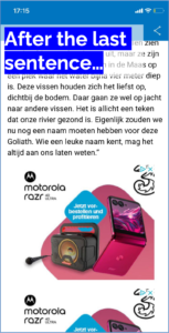
4. No one makes it to the end of the article detail page
The data uncovered another stark fact about the article: very few readers reached the end of the article detail page on mobile. Around 90% of visitors had already exited the page at a scroll depth of approximately 80-85%.
This suggested they had often reached the last sentence of the story, but anything displayed below it failed to capture their interest. On mobile, tags, response options, newsletter subscription blocks, and ads physically pushed the circulation blocks out of view.
In fact, like nearly every other news site, we continued displaying all the elements below the article on mobile just as they had appeared on desktops for decades. These elements were simply stacked, one on top of the other. As a result, the true value of our product— more journalism — was effectively hidden. Why would a visitor scroll past an ad just to check if more news was available when they had already read the main story?
Given this, it’s no surprise that the click-through rate to the next article was disappointingly low.
5. Kitchen memo effect on home- and section pages
Back to the homepage. While the story detail page is the gateway to our news brand for most people, the homepage remains an important route to our stories, especially for subscribers who use the app heavily.
Our homepage looked similar to many news sites: a top story, a few semi-top stories, but mostly a long list of articles with minimal hierarchy. Regardless of importance, every story had the same presentation. This continuous waterfall of news was occasionally interrupted by sections, columns, and ’the story of the day’ in fixed positions.
However, to our surprise, data showed these fixed positions performed significantly worse than dynamic news positions. On heat maps, we saw the audience literally navigating around these fixed positions.
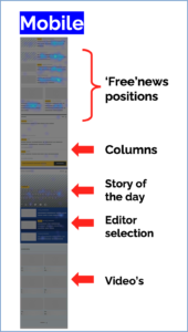
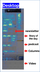
We dubbed this the ‘kitchen memo effect.’ What had worked well for ages on paper — fixed anchor points and a structured rhythm — proved far less effective on mobile and desktop.

The audience had apparently become blind to the content of these fixed elements. Editors in our newsroom actively avoided having their story selected as ‘Story of the Day,’ which should have been a warning sign. “Nobody will read me then…”
‘Story of the Day? Nobody will read me then…’
The data backed this up. Also with others brands in the company. A/B testing confirmed that moving a moderately performing column to a ‘regular news spot’ within the news feed after a few hours produced striking results. In one case, relocating a column that editors loved—but few readers clicked on—turned it into the most-read story of the week.
It was clear: we needed to abandon the digital fridge notes.
6. Never block the view of what comes next
A final lesson we learned from the data was that minimizing interruptions is crucial. On the homepage, overview pages, and article detail pages, mobile heatmaps revealed numerous clear exit points for readers. Particularly, full-screen listings, large marketing blocks, and the previously mentioned ad position below articles significantly increased the likelihood of users clicking away.
Once again, the legacy desktop design, forced onto a mobile screen, proved problematic. While desktop layouts comfortably accommodate ‘vertical’ lists alongside articles, on a mobile screen, these same lists obscure content below.
The most striking examples appeared on the homepage, where intrusive lists interrupted the natural scrolling flow. For instance, columns or sports sections. If a user had no interest in sports, this abrupt break became a stopping point. What wasn’t obvious was that the news continued below, off-screen.
Addressing this issue became one of the key priorities in the new design.
A new design: Ikea as inspiration
After the analysis phase, it was clear which problems we needed to tackle. Naturally, we adapted the editorial workflow. From now on, graphics were created with a mobile-first approach (which, in most cases, also worked perfectly for print and desktop).
A/B testing and headline experiments were conducted primarily on the mobile site, and a real-time mobile preview was integrated into the CMS—ensuring journalists were always aware of mobile requirements while writing. No more endless skyscrapers of text!
We also reversed the focus of online editors and rotated their big screens. Instead of spending the day looking at the desktop homepage, they now monitor the mobile version first.
Most importantly, we needed a new product — a site and app — designed with a mobile-first approach and then adapted for desktop.
We had five main objectives
- Click-through from one article to another
(Because we no longer wanted to be a stop-and-go-shop.) - Richer reading experience
(If mobile is our main product, we need readers to feel valued accordingly.) - Spotlight headlines
(We aimed to eliminate hyphenated headlines on mobile and enable switching between homepage teaser headlines, article headlines and social headlines for the same story.) - Presentation hierarchy
(Instead of sticky positions that clutter the view and lead to poor news choices, we wanted a structured hierarchy, avoiding an endless list where every article has the same presentation.) - Excellent, efficient editing method
(We didn’t want a design that forced writers to constantly adjust photos and headlines based on page position. We follow a ‘rich in-rich out’ principle: creators provide a detailed base version that adapts to any design requirements later in the pipeline.)
The Ikea principle: come in and stay!
Remember the heatmaps we ran and how our audience flew in and out? And how they slalomed around the spots on our homepage where we thought we had placed something special? That had to change—and the inspiration came furniture giant Ikea.
No company is better at attracting customers and leading them past all kinds of unexpected content. It’s a familiar scenario: you walk in to buy a kitchen lamp and end up at checkout with a basket full of items you didn’t know you needed.
The Ikea Principle: Come in and stay!
We even found a heatmap of an Ikea store. From entrance to exit, customers are strategically guided past all available products. And in the end, they walk out satisfied — hot dog in their hand! That’s exactly the experience we aimed to replicate with our new design.

The Process and Design Decisions
Of course, we wanted our new sites to be visually appealing and modern. But we approached the design project with data-driven insights and the Ikea-inspired vision in mind. Start with the mobile product detail page, the primary entry point for our traffic.
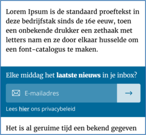
Our key focus was on enriching the article experience. We aimed to give editors more tools to break up long walls of text beyond just images. However, these enhancements had to complement the reading experience, not obstruct it.
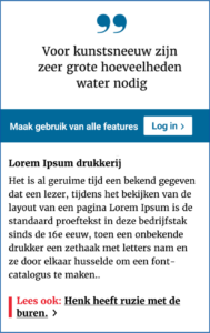
To achieve this, we introduced quotes, photo sliders, video blocks, ‘read too’ elements, and info blocks for deeper context within stories. None of these elements were full-screen; instead, they were designed to maintain a clear view of the rest of the text.
A great example is the ‘info block’, which is always collapsed by default—offering an entry point to additional information without disrupting the main reading flow for those who prefer to continue.

We also aligned with the B2C & B2B departments to ensure that marketing messages within articles were given limited screen space, designed to engage without obstructing or frustrating the reader.
TikTok-ing the Article Detail Page?
The most significant change we made was at the bottom of the article. In our effort to boost click-through rates, we eliminated all unnecessary distractions on mobile: no tags, no newsletter subscription blocks, no commenting sections, and not even an ad. If we truly wanted to emulate Ikea’s seamless browsing experience, we had to show more articles immediately after the current one.
And by increasing the article’s click-through rate, we would also drive more ad impressions and paywall conversions — a holistic strategy benefiting editorial, B2C, and B2B teams alike.
‘Since the article detail page had become the new homepage, we began treating it like one’
Since the article detail page had become the new homepage, we began treating it like one. In the new design, visitors reach the end of an article and seamlessly flow into a continuous stream of other articles—as if they were still on the homepage or an overview page. By prominently displaying circulation blocks, some of which were personalized, we aimed to encourage readers to continue exploring beyond the initial article they clicked on.
To validate our hypothesis, we conducted extensive testing on our old sites during the design process. We even performed a successful live A/B test where a new article automatically loaded at the bottom of the current one, just like TikTok, Instagram, and other social media platforms.
The result? A measurable increase in the click-through rate, proving that offering more content upfront was more effective than overwhelming users with unnecessary elements that drove them away.
Eye Candy: The Homepage as a Free Shop Window
The shop window concept also formed the foundation of our homepage redesign. We wanted to eliminate ‘sticky containers’ and create a completely dynamic shop window where editors could showcase the daily content mix in a visually engaging way.
Of course, we still feature a ‘story of the day,’ columns, podcasts, and videos. However, instead of being locked into fixed positions, these elements now receive the attention they deserve each day, dynamically presented like a true shop window display. Just like in retail, if you want to attract customers, you must present your offerings as appealingly as possible.
Rather than a traditional long list of articles, the news waterfall became a fluid stream of diverse teasers: big and small, with or without photos, with or without thumbnails, with or without intros. Eye candy, replacing the monotony of an endless feed.
‘If you want to attract customers, present your offerings as appealingly as possible’
In the newsroom, we categorize content into:
A-items: The top 5 stories of the day.
B-items: Stories we want to keep visible for longer.
C-items: More transient, urgent news that flows dynamically.
This structured approach ensures that every story gets its rightful place in the spotlight.
The Power of Position Four: A Second Top Story
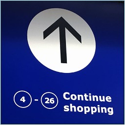
In particular, the ‘second top story’ at position four in the news stream proved to be a highly desirable position. It always has a unique signature story that none of our competitors have. These are stories that often require a lot of research, sometimes over weeks, but which could rarely be featured as top stories on the old site. Because there is always that one fire, burglary or unexpected bankruptcy that needs the top story slot.

You could even call the ‘position 4 spot’ the story of the day. But not labelled as such for the visitor, just presented as such. And it might just stay there for two or three days without getting in the way of the breaking news. Well, because it deserves that longer time in the spotlight and — long live the data! — we know that not all of our visitors come every day.
How About the Lists and the Ads?
And the lists, where have they gone? The most-read lists, section highlights, columns, and sports stories? The simplest answer: they have disappeared from the mobile homepage.
The more nuanced reality is that bundled collections still exist, but have been transformed into landscape sliders. These sliders take up no more space than a standard A-story and do not obstruct visibility of other articles further down in the news stream.
A great example is the sports block. It offers a quick entry point for sports enthusiasts, while ensuring those less interested can easily swipe past to the next set of teasers. This ensures that fresh content is always visible in the new design.
The same logic applies to ads. They are now strategically positioned within the news flow, ensuring they blend seamlessly without overpowering the content or disrupting reader engagement.
Launch & The Results
At the end of June 2024, the five regional websites and apps of our newspapers went live. It was a moment of celebration, marking nearly a year of hard work across the organization. But beyond the excitement, one pressing question remained: would all these changes deliver better results? More readers, more stories read, more engagement, and more new subscribers?
No matter how much research, A/B testing, and usability studies we had conducted—or how much effort we had poured into it—the true test was always whether the audience would agree. Great storytelling is one thing, but data (and readers) never lie.
Fortunately, six months in, we can breathe a sigh of relief and look at the results with pride.
Key Metrics at a Glance:
Stories Per Session: from 1.5 to 3.5
One of the most critical KPIs — recirculation from the article detail page —has significantly improved. Since two-thirds of our audience enters through articles, the ability to drive them to other stories is a major step forward. We always had great journalism; now, many more eyes are seeing it.
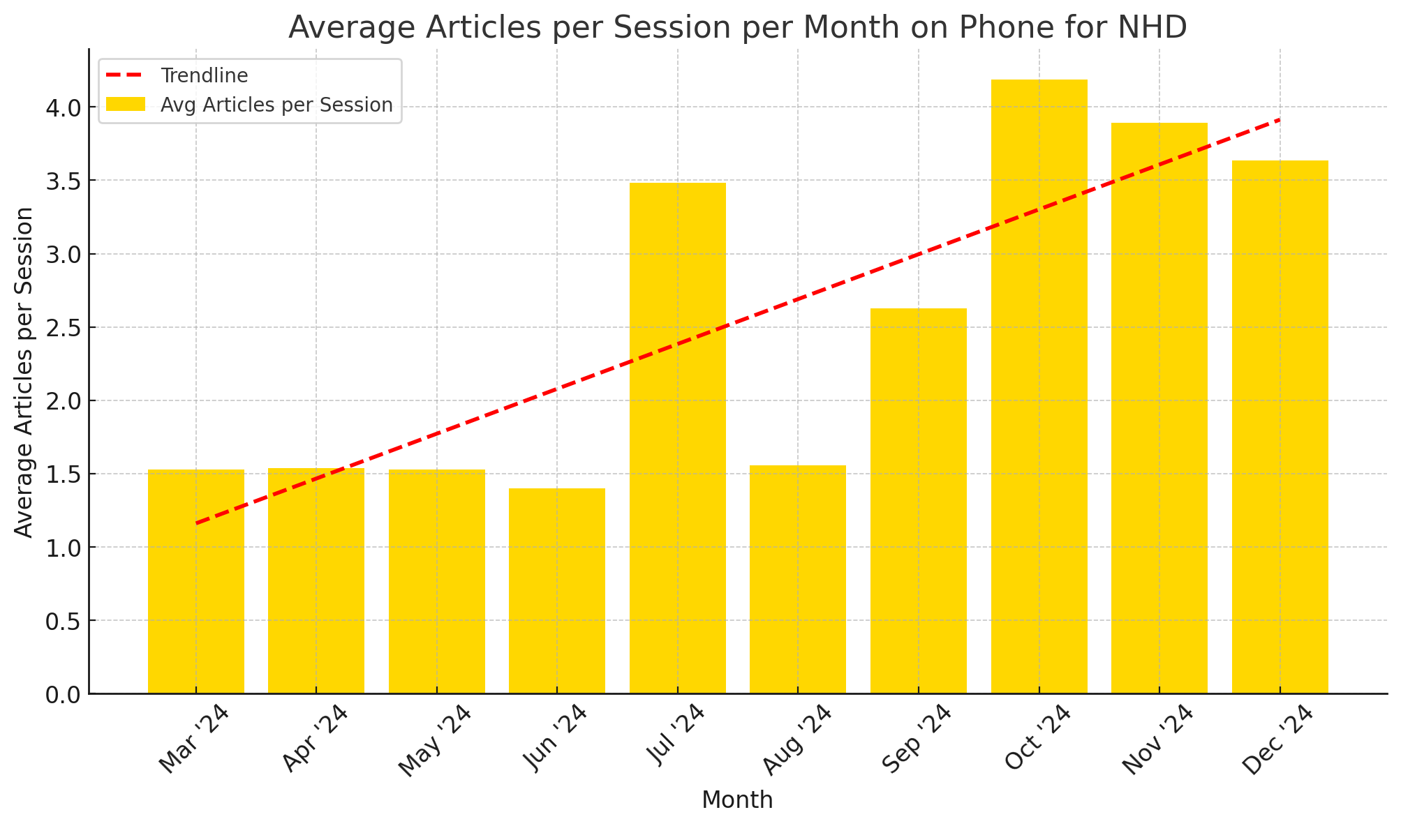
Average articles per session on phone for Noordhollands Dagblad
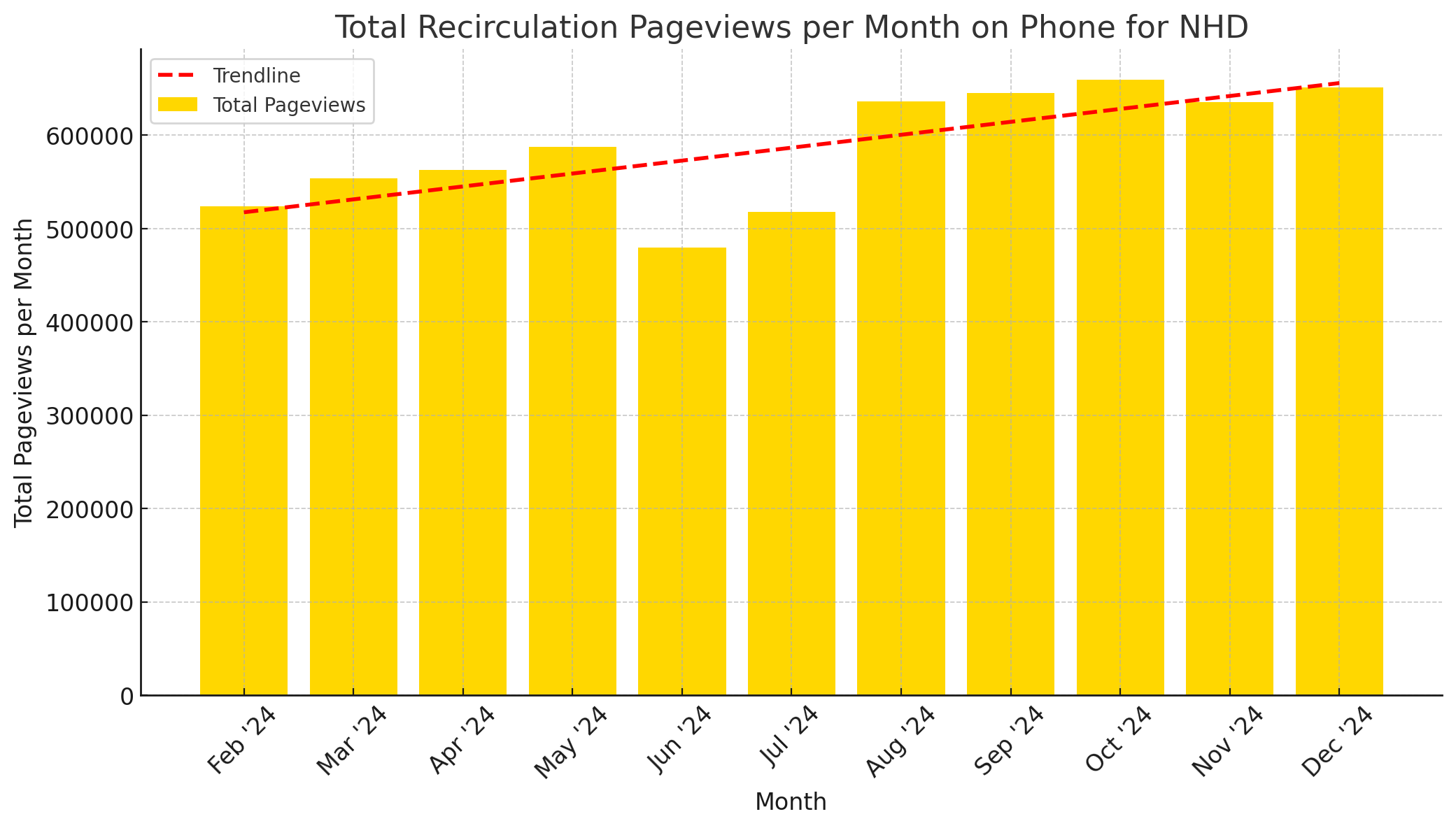
The amount of recirculation pageviews on a phone for Noordhollands Dagblad
Premium Attention Time on Mobile
We’ve long rejected the notion that mobile readers don’t engage deeply. Since shifting to web-first in 2019 — and continuously letting data challenge and inform our choices — attention time on our site has steadily risen. For our editors, this remains a key metric in validating the quality of our content.
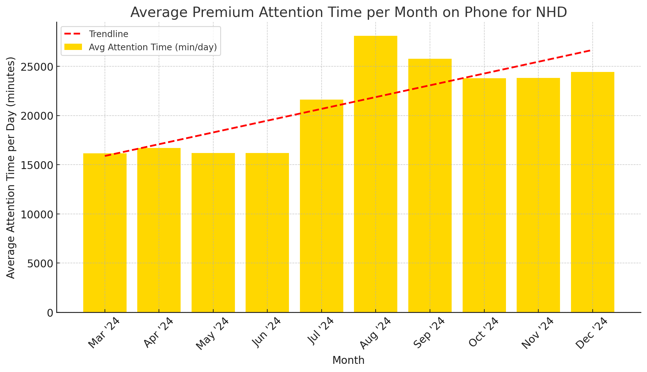
Average premium attention time per month on Noordhollands Dagblad, counted in average amount of minutes per day
Paywall Hits
The number of paywall triggers has increased since launching the new sites and apps, further validating our strategy.
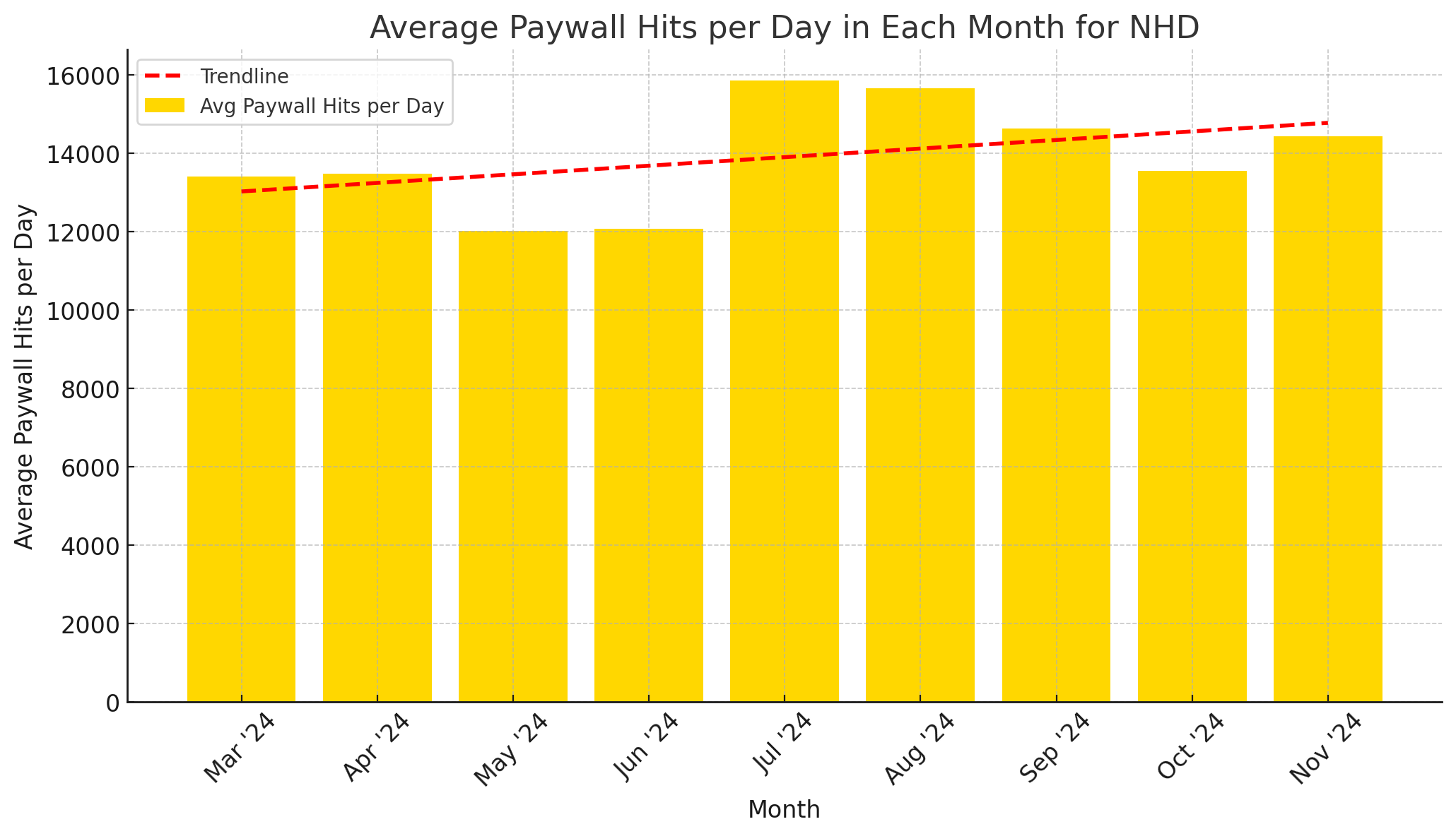
Average paywallhits per day per month on Noordhollands Dagblad
Conversions
Without adjusting pricing or promotional offers, the new sites have driven more subscriptions through the article paywall, especially on mobile.
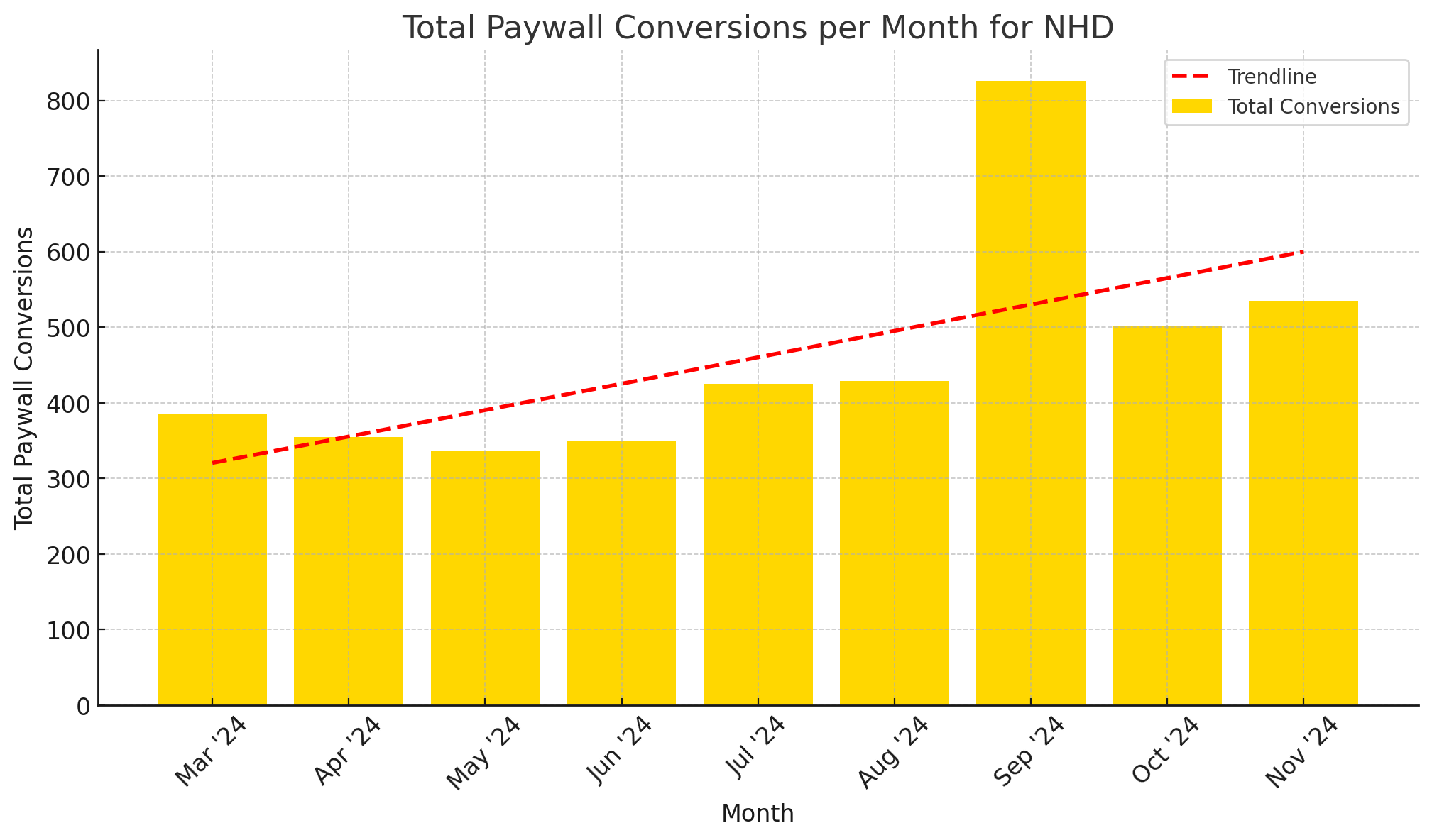
Paywall conversions per month on Noordhollands Dagblad
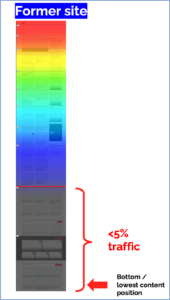
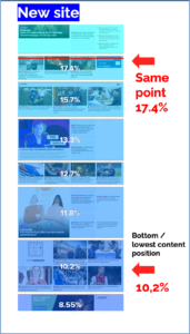
Scroll Depth
Our new homepage design, free of screen-filling interruptions, has led to a lower overall scroll depth, both on desktop (graphics below) and mobile. We were able to add more content positions ourselves as our audience went deeper into the site.
The Bottom Line
The results speak for themselves. By combining strategic design, reader insights, and a data-driven approach, we have successfully enhanced engagement, visibility, and conversions—proving that great content thrives when it’s presented the right way.
Final Word
For centuries, creating a newspaper has been a team effort—from journalists and photographers to printers and deliverers. That spirit of collaboration remains alive in the digital age. In the year we embraced a mobile-first focus, many within Mediahuis joined forces to develop the new mobile sites and apps for the regional titles around Amsterdam.
Claiming the success of this project as our own would be far too much credit, and it would greatly undervalue the contributions of so many colleagues across the company.
While many deserve recognition, we won’t risk leaving anyone out. Instead, we say this with heartfelt gratitude: thank you Mediahuis team!
January 2025
GerBen van ‘t Hek
Strategy Director Newsroom
gerben.vanthek@mediahuis.nl
Melle Drenthe
Digital Project & Data Manager
melle.drenthe@mediahuis.nl